
10 Donation Page Best Practices for Nonprofits
Donation page best practices for nonprofits: learn 10 ways to improve button placement, mobile giving, trust signals, form length, payment options, and donor follow-up.

AI Overview
• A strong donation page should make giving simple, mobile-friendly, trustworthy, and easy to complete.
• The most important donation page best practices include a visible donate button, short form, branded design, mobile-first layout, suggested gift amounts, recurring giving, trust signals, and multiple payment options.
• Nonprofits can improve online giving by reducing friction at each step: page load, form start, payment, and confirmation.
• GivingFuel helps nonprofits create branded, mobile-first donation pages with recurring giving, suggested amounts, Apple Pay, Google Pay, fee-cover options, QR codes, reporting, and donor records.
Why Most Donation Pages Underperform (And Where Yours Might Be Losing Donors)
Most donation pages underperform because the giving experience has too much friction.
A donor may click your donate button with every intention of giving, then abandon it because the page loads slowly, the form is too long, the payment step feels clunky, or the page feels disconnected from your organization.
Donation page friction usually happens in four places:
• Page load
• Donate button visibility
• Form length and clarity
• Payment and confirmation experience
The good news is, improving your donation page does not require a full website redesign. It simply requires making the giving process clearer, faster, and easier.
GivingFuel’s drag-and-drop donation page builder helps nonprofits create branded donation pages with suggested amounts, recurring gifts, fund allocations, Text-to-Give, social sharing, and flexible giving options.
1. Put the Donate Button Where Donors Expect It
Your donate button should be easy to find. Donors shouldn’t have to scroll, search, or even think about where to find it.
Place a clear donate button in the header of your website, on campaign landing pages, and anywhere supporters are likely to look for the next step.
Use action-focused language like:
• Donate Now
• Give Today
• Support Our Work
• Help Fund This Mission
Avoid vague verbiage like “Get Involved.” That can mean so many different things. Instead, use something like “Donate Now,” that tells donors exactly what to do.
A strong donation page should include four must-haves near the top:
• A clear headline connected to impact
• An obvious donate button
• Suggested gift amounts
• Trust signals that reassure donors
2. Design Mobile-First, Not Mobile-Responsive
Mobile giving is no longer a secondary experience. Many donors open emails, texts, social posts, and QR codes on their phones before their laptops.
A mobile-first donation page should be intentionally designed for a small screen from the start, not condensed down from a desktop layout.
Focus on:
• Single-column layout
• Large buttons
• Easy-to-tap fields
• Fast page speed
• Short form length
• Digital wallet options
GivingFuel’s mobile-first, branded donation pages support credit cards, ACH, Apple Pay, Google Pay, QR codes, Text-to-Give, recurring gifts, corporate matching prompts, and social proof pop-ups.
3. Keep the Donation Form Short
Every additional field on your form gives donors another chance to pause, get distracted, or leave.
A donation form should only ask for the information your team actually needs before payment.
For many campaigns, that means limiting required fields to:
• Name
• Email
• Payment information
Ask for a mailing address only when it is truly needed. If more details are needed down the road, you can use follow-up communication after the gift instead of making the donation form ask for too much upfront.
A short form is especially important for the mobile experience. The more typing donors have to do, the more likely the process starts to feel like paperwork.
GivingFuel’s donation pages are customizable, so nonprofits can build giving pages that fit the campaign without asking donors to move through unnecessary fields.
4. Build Trust With Branding
A donor should never wonder whether they are still giving to your organization.
Your donation page should look and feel like the rest of your nonprofit’s brand. That means using your logo, colors, imagery, campaign language, and mission-centered messaging throughout the giving experience.
Trust signals help too, but they work best when the whole page feels safe and credible.
Strong trust signals include:
• Secure payment language
• Clear nonprofit name
• EIN or tax-exempt information, when applicable
• Short donor testimonial
• Transparent use of funds
• Consistent branding from page to confirmation
GivingFuel’s donation page builder lets nonprofits create branded pages with custom colors, fonts, images, messaging, embedded or hosted forms, confirmation settings, emailed receipts, and flexible fund allocation.
5. Offer Smart Payment Options Including Fee Coverage
Donors should be able to give in the way that is most convenient for them.
At minimum, a strong donation page should support:
• Credit cards
• ACH or bank transfers
• Apple Pay
• Google Pay
• Recurring giving options
ACH can be helpful for larger gifts because bank transfers often cost less to process than cards. Digital wallets can reduce friction for mobile donors because supporters do not have to manually type card details.
Fee coverage can also help nonprofits keep more of each gift. It’s important to be transparent and make the option clear, honest, and optional. A simple message like “Help cover processing fees so more of your gift supports the mission” is easier to understand than vague fee language.
GivingFuel’s nonprofit payment processing supports credit cards, ACH, Apple Pay, Google Pay, Text or Scan to Donate, flexible payout schedules, fee reporting, fraud protection, and donor fee coverage.
6. Use Anchored Gift Amounts (And Make Monthly Easy to Choose)
Suggested gift amounts help donors decide faster.
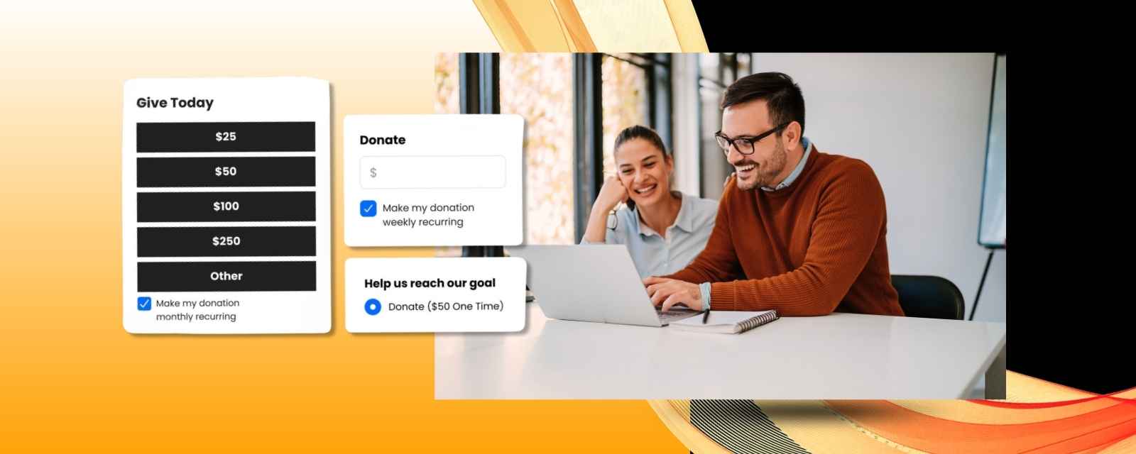
Instead of showing only a blank amount field, offer three or four clear giving options. For example:
• $25
• $50
• $100
• $250
Then briefly show how each amount connects to impact.
For example:
• $25 helps provide school supplies.
• $50 helps fund a week of meals.
• $100 helps support program materials.
Recurring giving should also be easy to choose. Monthly gifts can help nonprofits build more predictable support and give donors a simple way to stay connected over time.
GivingFuel supports suggested donation amounts, donor-chosen amounts, recurring gifts, fund allocations, and donor accounts. For a deeper look at recurring gifts, see GivingFuel’s guide on how GivingFuel handles recurring donations.
7. Show Impact Before Asking for a Donation
Donors are more likely to give when they clearly understand what their gift will help make possible.
Before asking for an amount, make the impact clear and specific. Your page headline and opening copy should answer:
• What is the need?
• Who will be helped?
• What will change if donors give?
• Why does this matter now?
Avoid generic headlines like “Support Our Mission.” Instead, use outcome-focused language that helps donors picture the result.
For example:
• Help provide 500 meals this month.
• Give students the supplies they need for school.
• Help families stay housed this winter.
You can also add social proof, like a campaign progress bar, donor count, or recent gift activity, to show that other supporters have already started taking action.
GivingFuel’s donation page features include widgets, goal meters, social proof pop-ups, progress tools, and social sharing options.
8. Improve Donor Follow-Up After the Gift
The donor experience should continue long after someone clicks “submit.”
After a donation, the donor should immediately know three things:
• Their gift went through.
• Their gift matters.
• What happens next.
A strong post-donation experience includes:
• A clear confirmation page
• An immediate receipt
• A warm thank-you email
• Clear next steps
• Impact-focused follow-up
While the receipt is important, it should not be the only follow-up message a donor receives. A thank-you should feel warm and specific, not like a payment confirmation with added fluff.
GivingFuel lets nonprofits customize confirmation pages and emailed receipts through its donation page tools. It also offers email automation and donor engagement tools to help teams follow up after the gift.
9. How to Improve Donation Page Conversion Rates
Your donation page will get stronger when your team keeps making small, focused improvements over time.
Start with the parts of the page that are most likely to reduce friction:
• Test a clearer donate button, such as “Donate Now,” “Give Today,” or “Support This Mission.”
• Try suggested gift amounts that match your donor base and campaign goal.
• Move the monthly giving option higher on the form so donors see it before checkout.
• Reduce the number of required fields so the form is faster to complete.
• Add easier payment options like Apple Pay, Google Pay, ACH, or credit card.
• Place trust signals near the payment step, such as secure payment language or a short note about how gifts are used.
• Make the fee-cover message clear, optional, and easy to understand.
• Review the mobile experience to make sure buttons, fields, and payment options are easy to use from a phone.
For smaller teams, the goal is to make one useful improvement at a time. Choose one change, run it for a few weeks, and watch what happens to conversion rate, average gift size, and recurring gift signups.
GivingFuel’s analytics and custom reports help nonprofits track donation performance, conversion rates, average donation size, fund tracking, exports, and scheduled reports.
For more detail, check out GivingFuel’s online donation conversion rate guide.
10. Run a 10-Minute Donation Page Self-Audit
Uncovering the biggest issues on your donation page does not require a full redesign.
Use this quick self-audit:
• Does the page load quickly on mobile?
• Is the donate button visible without scrolling?
• Does the page match your organization’s branding?
• Is the form short?
• Are suggested gift amounts clear?
• Is monthly giving easy to choose?
• Are Apple Pay and Google Pay visible?
• Is fee coverage clearly explained?
• Are trust signals near the payment step?
• Does the confirmation page feel connected to your mission?
Count how many of these 10 items your page already does well. If your score is under 7, start with the gaps that create the most friction: mobile speed, button visibility, form length, payment options, and trust signals.
GivingFuel helps nonprofits fix these common donation page issues with branded pages, short forms, recurring giving, digital wallet options, fee coverage, reporting, and donor follow-up tools.
FAQs
What are donation page best practices?
Donation page best practices include using a clear donate button, mobile-first layout, branded design, short form, suggested gift amounts, recurring giving, trust signals, multiple payment options, and a strong post-donation follow-up.
What should I put on a donation page?
A donation page should include a clear headline, impact-focused copy, suggested gift amounts, recurring giving option, short form, secure payment options, trust signals, and a clear donate button.
How long should a donation form be?
A donation form should be as short as possible. For many campaigns, the only required fields before payment should be name, email, and payment information.
Should nonprofits use Apple Pay and Google Pay?
Yes. Apple Pay and Google Pay can make mobile giving easier because donors do not have to manually enter card details. GivingFuel supports Apple Pay and Google Pay through its donation page and payment tools.
What makes an effective donation page?
Effective donation pages are branded, mobile-friendly, easy to complete, and focused on impact. They usually include a clear headline, suggested gift amounts, recurring giving options, secure payment methods, trust signals, and a thoughtful thank-you experience after the gift. To see the tools GivingFuel provides for building stronger donation pages, explore the Donation Page Builder.
How can nonprofits improve donation page conversion rates?
Nonprofits can improve donation page conversion rates by making the page mobile-friendly, keeping the form short, using a clear donate button, adding suggested gift amounts, offering recurring giving, showing trust signals, and making payment options easy to complete.
Start Improving Your Donation Page Today
The highest-impact fundraising fix for many nonprofits is improving the donation page.
Start with the basics: make the donate button easy to find, shorten the form, improve the mobile experience, show impact clearly, offer modern payment options, and send a thoughtful thank-you after every gift.
GivingFuel helps nonprofits put these donation page best practices into action with branded mobile-first pages, suggested gift amounts, recurring giving, Apple Pay, Google Pay, ACH, fee-cover options, QR codes, social proof tools, donor records, reporting, and follow-up.
Want to see how GivingFuel helps nonprofits build better donation pages? Explore the Donation Page Builder, review Donation Pages & Forms, or sign up with GivingFuel today.
We’re here to help make online giving simpler, more connected, and easier to manage.
— The GivingFuel Team

The world's #1 All-in-one fundraising, engagement, CRM, and marketing platform for nonprofits. GivingFuel helps you do more, raise more and keep more.
Help & Support: team@givingfuel.com
Sales: sales@givingfuel.com
© 2026 Giving Fuel. All rights reserved.
We, like the rest of the internet, use cookies and similar technologies, including third-party analytics and reporting tools, to operate our site, and analyze usage and performance. These tools may collect information such as pages visited, interactions, device/browser details, and identifiers. But we do not sell or share your information with third-parties.
You probably won't read this nor our policies, but we are required by law (and legal trolls who ruin everything) to show you this popup before you proceed. By continuing to use our site, you acknowledge and agree to this use of cookies and technologies as described in our Privacy Policy and Terms and Conditions